As a part of my hyperparameters tuning during my last machine learning project I was changing 3 parameters and scoring my models with mean absolute error. The process yielded 4 values:
- n_features - number of features
- n_est - number of estimators
- max_depth - maximum depth of ensemble regressors
- mean absolute value - the scoring value of model trained with varying 3 above parameters.
- marker size
- marker type
- marker colour/transparency.
 import numpy as np
import pandas as pd
import matplotlib.pyplot as plt
from matplotlib import rcParams


rcParams["font.size"] = 15

dat = pd.read_json("4d_plot_data.json")

xs = dat["n_features"]
ys = dat["n_est"]
zs = dat["mae"]
cs = dat["max_depth"]

xs2 = xs.unique()
ys2 = ys.unique()

xx, yy = np.meshgrid(xs, ys)
xticks = [0.05] + list(np.linspace(0.2, 1, 5))

fig, ax = plt.subplots(figsize=(25, 15), subplot_kw={"projection": "3d"})
ax.scatter(xs, ys, cs,
           marker=".")
ax.scatter(1, 100, 3, marker="v", c="r", s=100)
ax.set(ylabel="n_estimators",
       xlabel="n_features",
       zlabel="max_depth",
       zticks=cs.unique(),
       zlim=(3, 6),
       xticks=xticks,
       )
ax.set_title("No 4-th dimension")

plt.tight_layout()
plt.show()
Below is the plot that will be generated after running the code.
Well, the plot is rather hardly telling anything. The red triangle shows default parameters case. Let's then add 4-th dimension (size of the markers). The plotting function should now look like:
fig, ax = plt.subplots(figsize=(25, 15), subplot_kw={"projection": "3d"})
ax.scatter(xs, ys, cs,
           s=zs*-5,
           marker=".")
A little explanation - the mean absolute value that I received from sklearn cross_val_score function is multiplied by -1 so that the more, the better. That is why in the above code snippet it is multiplied by -5. There is one problem with such solution. The "the more, the better" principle is now reversed, so now parameters of better performing machine learning models are shown as smaller points. Below is the plot:
 # normalisation
alpha = ((zs-zs.min())/(zs.max()-zs.min()))

# colour array
rgba_colors = np.zeros((zs.shape[0], 4))
rgba_colors[:, 2] = 1.0
rgba_colors[:, 3] = alpha

fig, ax = plt.subplots(figsize=(25, 15), subplot_kw={"projection": "3d"})
ax.scatter(xs, ys, cs,
           c=rgba_colors,
           marker=".")
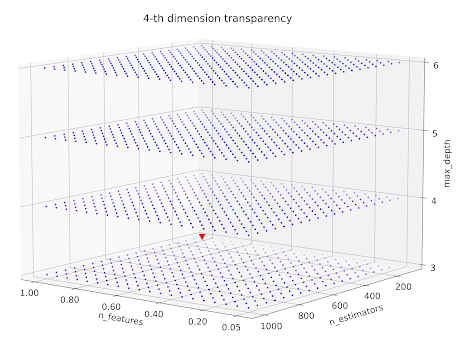
With normalisation we keep the "the more, the better" principle. If we would like to plot alpha in the function of MAE we would do the following:
fig, ax = plt.subplots(figsize=(25,15))
ax.scatter(zs, alpha)
ax.set(xlabel="mean absolute error",
       ylabel="normalised")
plt.tight_layout()
plt.show() fig, ax = plt.subplots(figsize=(25, 15), subplot_kw={"projection": "3d"})
ax.scatter(xs, ys, cs,
c=rgba_colors,
s=alpha*100,
marker=".")
Not bad, but still the least transparent points do not differ that much. What can we do? Let's embrace the power of power! Now we will change the linearity of the normalised mae to mae relationship. I chose the power of 5. Check the below code and plot:rgba_colors[:, 3] = alpha**5
fig, ax = plt.subplots(figsize=(25, 15), subplot_kw={"projection": "3d"})
ax.scatter(xs, ys, cs,
c=rgba_colors,
s=alpha**5*100,
marker=".")


